Document Parameter
In the document function "Document Parameter", the input mask that appears when generating a document can be configured.
The configuration can be roughly divided into three parts:
- DataNodes: In the "CustomContentSection" the fields, so-called DataNode controls, are defined.
- View: In the "View" section, the appearance of the document parameters is defined.
- DataSources: In "DataSources" database queries can be defined and the values can be used from the query.
Basic structure
<Configuration>
  <CustomContentSection xmlns:xsd="http://www.w3.org/2001/XMLSchema" xmlns:xsi="http://www.w3.org/2001/XMLSchema-instance" Name="Dokument-Parameter" WindowWidth="750" WindowHeight="750">
    <DataNodes>
      <!-- DataNode controls are defined here -->
    </DataNodes>
  </CustomContentSection>
  <Views>
    <View>
      <!-- The appearance of the dialog is defined here -->
    </View>
  </Views>
</Configuration>
Note
If a basic setup is encountered where the Views control is missing: see Old configuration.
CustomContentSection
At the top of the "DataNodes" the controls are defined, which are accessed in the "View" in the lower part. In the View the appearance of the document parameter is defined. In the DataSources part, database queries can be defined, and the values from the query can be written to the controls defined under "DataNodes".
Example:
<CustomContentSection Name="Dokument-Parameter" WindowWidth="750" WindowHeight="750">
Attributes in CustomContentSection:
| Attribute name | Description |
|---|---|
| Name (Window name) | Here the name of the Document Parameter dialog window will be defined. |
| WindowWidth (Window width) | Here the window width in pixels can be defined. 1200 pixels should not be exceeded, because at this resolution the proper display of OneOffixx should be possible. |
| WindowHeight | Here you can define the window height in pixels. 1200 pixels should not be exceeded, because at this resolution the proper display of OneOffixx should be possible. The value for WindowHeigth must be set (applies for use with and without views). If the content exceeds the defined WindowHeight, a scrollbar will be inserted automatically. |
In contrast to the configuration defined above, in the example below the values of the WindowWidth and WindowHeight attributes are swapped out to the Global Configurations:
<?xml version="1.0" encoding="utf-8"?>
<Configuration>
  <CustomContentSection xmlns:xsd="http://www.w3.org/2001/XMLSchema" xmlns:xsi="http://www.w3.org/2001/XMLSchema-instance" WindowHeight="{[DocParam.WindowHeight]}" WindowWidth="{[DocParam.WindowWidth]}" Name="{U[DocParam.WindowName]}">
  <DataNodes>
      <!-- DataNodes are defined here -->
    </DataNodes>
  </CustomContentSection>
  [...]
</Configuration>
Thanks to this outsourcing to the Global Configurations it is ensured that the mentioned information only needs to be changed in one place. Consequently, changes are conveniently applied in all templates that have this link. If a different value needs to be set in the template than the one in the Global Configurations, a different value is simply written in the quotes.
DataNodes
This section is about the configuration between <DataNodes> and </DataNodes>. Each DataNode defines a Document Parameter field that can be accessed in the editor, in scripts or via extended bindings. For each field that exists in the Views, a DataNode must be created for reuse.
Basic structure of a DataNode:
<ControlName Id="DocParam.FieldName"></ControlName>
Instead of "control name" the DataNodes below can be used. The Id is mandatory in every control and is displayed in editor mode and needed afterwards for use in editor, scripts or extended bindings. The Id must not contain spaces and must be unique.
Note
If an Id is duplicated in the DataNodes (NOT in the view!), then the Document Parameter dialog cannot be opened.
Basic attributes
The following attributes can be inserted into any type of DataNode:
| Attribute name | Description |
|---|---|
| Id | Is mandatory in every control. It is needed to identify the field, to insert it into the document and for use in scripts or extended bindings. The id must not contain spaces and must be unique. |
| Label | Label of the control in the OneOffixx function Quick Check panel in Word. The Tracked attribute is required. |
| Tooltip | Hint displayed when the user hovers over it, e.g. Subject for the letter.Overridden by ValidationMessage if set. |
| Tracked | The Quick Check is activated with the Tracked. If the value is set to true, the field will be displayed to the user in the separate panel. If the content of the control is empty, the field will be displayed red in the panel and green after editing. |
Text
Inserted in Word as a Plain Text Content Control. In the view, the Text control can be used to reference a TextBox, a RadioButton, a ComboBox, or a CheckBox. Depending on which of the below controls is used, something different will appear in Word in the text box:
| Defined in the view | Description |
|---|---|
| TextBox | The text entered in the Document Parameter appears in the content control. |
| RadioButton | Only suitable for scripts and extended bindings; the content control will not be filled. |
| CheckBox | Only suitable for scripts and extended bindings; the content control will display true (CheckBox enabled) or false (CheckBox disabled). |
| ComboBox | In the content control is filled what was defined in the Label attribute in the view. |
Examples:
Content:
If something is written in between the start and end tag, the entered text is already in the text field when the document is generated. In the extended example e.g. Invitation.
Attributes for text controls:
| Attributname | Beschreibung |
|---|---|
| Regex | The attribute allows to define a regex (.NET syntax) that must find at least one match in the entered text. Attention: if the whole text must match or if there must be only exactly one 'match', this must be defined by the regex expression. Examples: Regex="[0-9]+" forces that at least one character of the input text must be a digit. For example, "Hello 205" is a valid input. Regex="^[0-9]+$" forces that all characters of the input text must be digits and that at least one digit must be present. (^ matches the beginning of the input text and $ matches the end) Online tool to create regex |
| Required | It defines whether the field may be left empty (Required="false" or not set) or whether the field must be filled in (Required="true"). As long as the text field is not filled in, the OK button for confirming the input in the Document Parameter remains grayed out and is not clickable. As soon as the required characters are filled in the text field, the OK button can be clicked. The Required attribute is overridden by the validation (Regex attribute) if one is set. |
| ValidationMessage | If Required="true" or a validation regex is set, ValidationMessage allows a custom error message if validation fails. It will be displayed as soon as the mouse pointer hovers over the red exclamation mark on the right side of the text field. If ValidationMessage is not set, a default message will be displayed in case of a mismatch. |
DateTime
Becomes a Date Picker Content Control in Word with calendar selection, and is also displayed that way in the Document Parameter.
Examples:
- Simple
- Advanced – fixed date preselected
- Advanced – today + 2 days (day after tomorrow) as preselected date
<DateTime Id="DocParam.Date" />
Content:
If the date is set between the start and end day, it is preselected when opened, such as 2022-08-15 for Thursday, August 15, 2022. If the content is empty, the current date is preselected in each case.
Attributes for DateTime controls:
| Attribut name | Description |
|---|---|
| Calendar | It sets the format of the calendar. Default is "Gregor". It is not mandatory to set this attribute. |
| Format | Definition of the date format e.g. "dd MM yyyy" for "02.06.2016", List of date formats. There are several date formats stored in the Global Translations base configuration that can be accessed. |
| Offset | Here you can use days to calculate the date ahead, starting from the current date, e.g. using +2, which means "today in 2 days". Another possibility: -2 for "today 2 days ago".This attribute has no effect if a fixed date is preselected via the control content. |
CheckBox
Inserted in Word as a check box content control and is for a yes/no selection.
Examples:
Content:
If true is set between the start and end tags, the CheckBox is already checked when generating.
Attributes for CheckBox controls:
| Attribute name | Description |
|---|---|
| Required | It defines whether the field may be left empty (Required="false" or not set) or whether the field must be filled in (Required="true"). As long as the text field is not filled in, the OK button for confirming the entries in the Document Parameter remains grayed out and is not clickable. As soon as the required characters are filled in the text field, the OK button can be clicked. The Required attribute is overridden by the validation (Regex attribute) if one is set. |
ComboBox
Is inserted into Word as a combo box content control, also called a dropdown. It is for choosing between given values (any input is allowed in Word).
Examples:
<ComboBox Id="DocParam.ReasonForCongratulation" SelectedValue="employeeAnniversary">
  <Item Value="birthday" DisplayText="Birthday"  />
  <Item Value="employeeAnniversary" DisplayText="Employee anniversary"  />
  <Item Value="motherFatherhood" DisplayText="Mother-/Fatherhood"  />
</ComboBox>
Content:
Item controls can be defined as content. Each item is available to the user as an entry in the combo box. The Value of the item is accessed in scripts.
Attributes for the Item control:
DisplayText- Display text in Document Parameter dialog and combo box content controls in Word.
- Generally applies as content of this OneOffixx field, such as when accessed in scripts with
<Element id="DocParam.ReasonForCongratulation " />. - Used in scripts for conditions when there is no
$character in front of the id.
So in the above example,<Condition when="DocParam.ReasonForCongratulation = 'Employee Anniversary'>is true.
Value- Must not be empty – it must contain at least one character. It should not contain spaces or special characters as Word does not accept them.
- Used in scripts for conditions when there is a
$character in front of the Id.
In the example above,<Condition when="$DocParam.ReasonForCongratulation = 'employeeAnniversary'>is thus true.
Attributes for ComboBox controls:
| Attribute name | Description |
|---|---|
| IsEditable | If set to true, the user can also make any entry to the fixed entries. Otherwise the user can only choose between the existing entries. |
| IsSearchEnabled | If set to true, the user can search for existing entries by keyboard input in the combo box. |
| SelectedValue | Determines which item is preselected in the combo box. The Value must be entered from the Item control, e.g. employeeAnniversary. |
Collection
The Collection-DataNode is a function extension of the ComboBox. As the name suggests, a Collection is a collection of values. The difference between the collection of values in a Collection and values in a ComboBox is that the Collection can store complex data structures, while the ComboBox only allows a simple Key → Value mapping. Example:
<Collection Id="Employee">
  <Element>
    <Text Id="PersonnelNumber">1234</Text>
    <Text Id="FirstName">John1</Text>
    <Text Id="Name">Doe1</Text>
    <Text Id="Phone">0001234567</Text>
    <Text Id="Function">Team leader</Text>
  </Element>
  <Element>
    <Text Id="PersonnelNumber">2234</Text>
    <Text Id="FirstName">John2</Text>
    <Text Id="Name">Doe2</Text>
    <Text Id="Phone">0003214567</Text>
    <Text Id="Function">CFO</Text>
  </Element>
  <Element>
    <Text Id="PersonnelNumber">4321</Text>
    <Text Id="FirstName">John3</Text>
    <Text Id="Name">Doe3</Text>
    <Text Id="Phone">0001234876</Text>
    <Text Id="Function">CEO</Text>
  </Element>
  [...]
  <Element>
    [...]
  </Element>
</Collection>
A collection contains any number of elements, which in turn contain any number of text controls. These text controls are uniquely identified with an id. A Collection serves as the data basis for a ComboBox.
Since the Collection stores several values per entries, a corresponding mapping possibility for these values is still needed. For storing the values, the already known DataNodes (in the CustomContentSection) are defined according to the known scheme:
<Text Id="Employee.PersonnelNumber" />
<Text Id="Employee.FirstName" />
<Text Id="Employee.Name" />
<Text Id="Employee.Phone" />
<Text Id="Employee.Function" />
The naming can be chosen as desired. In this example, the Id was used as a prefix for the sake of clarity. Thus, based on this collection and the DataNodes, the following ComboBox can be defined in the Views:
<ComboBox Id="Employee" CollectionLabelMember="Name">
  <CollectionSelectionMap Source="PersonnelNumber" Target="Employee.PersonnelNumber" />
  <CollectionSelectionMap Source="FirstName" Target="Employee.FirstName" />
  <CollectionSelectionMap Source="Name" Target="Employee.Name" />
  <CollectionSelectionMap Source="Phone" Target="Employee.Phone" />
  <CollectionSelectionMap Source="Function" Target="Employee.Function" />
</ComboBox>
The id of the ComboBox is identical to that of the Collection. As with other DataNodes, this establishes the connection between the defined DataNode and the corresponding view element. The CollectionLabelMember specifies which text control of the elements in the Collection should be displayed in the ComboBox for selection, in this example the name of the employee. The ComboBox is displayed in the dialog as follows:

The CollectionSelectionMap defines which text of the selected element from the collection (source) is written to which DataNode (target). If an item is selected, the values of the selected item are written to the DataNodes according to the defined CollectionSelectionMap and can then be used according to the known scheme.
The complete configuration now looks like this:
<Configuration>
  <CustomContentSection
	xmlns:xsd="http://www.w3.org/2001/XMLSchema"
	xmlns:xsi="http://www.w3.org/2001/XMLSchema-instance"
	Name="{[DocParam.Config.WindowName]}"
	WindowHeight="450"
	WindowWidth="{[DocParam.Config.WindowWidth]}">
    <DataNodes>
      <!-- DataNodes auf welche die Werte des ausgewählten Eintrages geschrieben werden  -->
      <Text Id="Employee.PersonnelNumber" />
	    <Text Id="Employee.FirstName" />
	    <Text Id="Employee.Name"  />
	    <Text Id="Employee.Phone" />
      <Text Id="Employee.Function" />
      <!-- Die Collection welche die Einträge enthält -->
      <Collection Id="Employee">
        <Element>
          <Text Id="PersonnelNumber">1234</Text>
          <Text Id="FirstName">John1</Text>
          <Text Id="Name">Doe1</Text>
          <Text Id="Phone">0001234567</Text>
          <Text Id="Function">Team leader</Text>
        </Element>
        <Element>
          <Text Id="PersonnelNumber">2234</Text>
          <Text Id="FirstName">John2</Text>
          <Text Id="Name">Doe2</Text>
          <Text Id="Phone">0003214567</Text>
          <Text Id="Function">CFO</Text>
        </Element>
        <Element>
          <Text Id="PersonnelNumber">4321</Text>
          <Text Id="FirstName">John3</Text>
          <Text Id="Name">Doe3</Text>
          <Text Id="Phone">0001234876</Text>
          <Text Id="Function">CEO</Text>
        </Element>
      </Collection>
    </DataNodes>
  </CustomContentSection>
  <Views IsDebug="false">
    <View Id="main" Label="{[DocParam.LabelMainView]}">
      <Row>
        <TextBlock Style="h1" ColumnSpan="3">Title</TextBlock>
        {[DocParam.DefaultImage]}
      </Row>
      <Row>
        <Separator ColumnSpan="4" />
      </Row>
      <Row>
      <!-- ComboBox welche die Collection als Datengrundlage hat -->
       <ComboBox Id="Employee" CollectionLabelMember="Name">
          <CollectionSelectionMap Source="PersonnelNumber" Target="Employee.PersonnelNumber" />
          <CollectionSelectionMap Source="FirstName" Target="Employee.FirstName" />
          <CollectionSelectionMap Source="Name" Target="Employee.Name" />
          <CollectionSelectionMap Source="Phone" Target="Employee.Phone" />
          <CollectionSelectionMap Source="Function" Target="Employee.Function" />
        </ComboBox>
      </Row>
      <Button Type="Submit" Label="{[DocParam.LabelSubmitButton]}" />
      <Button Type="Cancel" Label="{[DocParam.LabelCancelButton]}" />
    </View>
  </Views>
</Configuration>
When do Collections come into play?
Collections are mainly used when a selection exists on which several values directly depend. This can also be achieved with ComboBoxes without Collections, but without Collection the maintenance is more complex.
Example:
We have a ComboBox "Country" with the following selection: Switzerland Germany Austria Then there are two more fields, Currency and Capital, which depend on the selection in the ComboBox. The mapping looks like this:
| Country | Currency | Capital |
|---|---|---|
| SwitzerCountry | CHF | Bern |
| Germany | Euro | Berlin |
| Austria | Euro | Vienna |
The configuration without Collections
The ComboBox:
<ComboBox Id="Country">
  <Item Label="Switzerland" Value="Switzerland" />
  <Item Label="Germany" Value="Germany" />
  <Item Label="Austria" Value="Austria" />
</ComboBox>
The dependent fields (as scripts):
<CustomDataNode id="Country.Capital">
  <Condition when="Country = 'Switzerland'">
    <Text>Bern</Text>
  </Condition>
  <Condition when="Country = 'Germany'">
    <Text>Berlin</Text>
  </Condition>
  <Condition when="Country = 'Austria'">
    <Text>Vienna</Text>
  </Condition>
</CustomDataNode>
<CustomDataNode id="Country.Currency">
  <Condition when="Country = 'Switzerland'">
    <Text>CHF</Text>
  </Condition>
  <Condition when="Country = 'Germany'">
    <Text>Euro</Text>
  </Condition>
  <Condition when="Country = 'Austria'">
    <Text>Euro</Text>
  </Condition>
</CustomDataNode>
Here it becomes directly apparent; if a new country has to be added, the adjustment or a condition must also be added in these two scripts.
The configuration with Collections
<Text Id="Country.Name" />
<Text Id="Country.Currency" />
<Text Id="Country.Capital" />

<Collection Id="Country">
  <Element>
    <Text Id="Name">Switzerland</Text>
    <Text Id="Currency">CHF</Text>
    <Text Id="Capital">Bern</Text>
  </Element>
  <Element>
    <Text Id="Name">Germany</Text>
    <Text Id="Currency">Euro</Text>
    <Text Id="Capital">Berlin</Text>
  </Element>
  <Element>
    <Text Id="Name">Austria</Text>
    <Text Id="Currency">Euro</Text>
    <Text Id="Capital">Vienna</Text>
  </Element>
</Collection>

<ComboBox Id="Country" CollectionLabelMember="Name">
  <CollectionSelectionMap Source="Name" Target="Country.Name" />
  <CollectionSelectionMap Source="Currency" Target="Country.Currency" />
  <CollectionSelectionMap Source="Capital" Target="Country.Capital" />
</ComboBox>
If a country is added to the selection with this configuration, only the entry in the collection has to be completed.
Note
There are two types of DataNodes: DataNodes and ViewDataNodes. The DataNodes are defined inside the CustomContentSection, the ViewDataNodes directly after the Views element. In XML both are called the same; DataNodes.
The decisive difference between the DataNodes and the ViewDataNodes is that the ViewDataNodes exist only in the Document Parameter. When the document is generated, they are then removed. If the Document Parameter is opened again from the document, the data is loaded again from the configuration of the template, not from the Word document itself. The DataNodes, on the other hand, are also transferred to the document. The ViewDataNodes are especially suitable when working with large collections. The unselected entries are not transferred to the document. This way, much less data is taken along.
Views
Within the Views start and end tag there are individual View structures. A view contains texts, images, input options (text boxes, check boxes, combo boxes, ...) and buttons.
It is possible to define several View structures. The user can change the view by clicking on buttons (usually "Next" and "Back").
Basic structure
- Any number of view elements can be created.
- A view can contain any number of row elements.
- By default, a view has 4 columns. However, the number of columns can also be set to 1, 2, 3, 4, 6 or 12 with the
Columnsattribute. - If you do not want to display a Document Parameter dialog, but only configure Document Parameter using the Quick Check, you can set the attribute
IsVisible="false"on the level of theViewselement.
Only one View:
<Views>
  <View Id="main" Label="First view">
    <Row>[...]</Row>
    <Row>[...]</Row>
    [...]
    <Button Type="Submit" Label="OK" />
    <Button Type="Cancel" Label="Cancel" />
  </View>
</Views>
Multiple views:
<Views>
  <View Id="main" Label="First view">
    <Row>[...]</Row>
    <Row>[...]</Row>
    [...]
    <Button TargetView="SecondView" Label="Next" IsDefault="true" />
    <Button Type="Cancel" Label="Cancel" />
  </View>
  [...]
  <View Id="SecondView" Label="Second view">
    <Row>[...]</Row>
    <Row>[...]</Row>
    [...]
    <Button TargetView="main" Label="Back" IsDefault="true" />
    <Button Type="Submit" Label="OK" />
    <Button Type="Cancel" Label="Cancel" />
  </View>
</Views>
Special id: main: This view is the start view. In any case, a view with the Id main must be configured.
Navigation switches outside Rows
<Button TargetView="SecondView" Label="Next" IsDefault="true" />
<Button Type="Submit" Label="OK" />
<Button Type="Cancel" Label="Cancel" />
Attributes for buttons:
Label: Label of the buttonTargetView: Id of the target view for forwarding buttonsType: Special actions- value
Submit: exit Document Parameter dialog, continue in generation process - Value
Cancel: Exit Document Parameter dialog, abort generation process
- value
IsDefault: If set totrue: Determines the default action on Enter
Rows and their content
In addition to buttons, views also contain rows. The rows contain the actual content of the view and structure and form controls can be inserted into them. The structure controls are purely for customizing the appearance of the Document Parameter. The form controls are for inserting into the template or for inserting into scripts and extended bindings.
Attributes of the structure and form controls:
The views are divided into 4 columns by default. Each structure and form control has a width of 1. To increase the width, the ColumnSpan attribute is used. The structure and form controls are inserted from left to right. If a field is to be displayed offset by one column, this is accomplished with ColumnOffset="1".
The following attributes can be used for both structure controls and form controls:
| Attribute name | Description |
|---|---|
| Bind | Allows to show and hide rows or controls, see Chapter Bindings. |
| ColumnOffset | Specifies how many columns to skip before the field (i.e. the number of "indents") |
| ColumnSpan | Specifies how many columns the field takes up. This can be up to number 12 depending on the number of columns. If nothing is specified, it is the value 1. |
| IsEnabled | If false or 0: Field is disabled (interactions are no longer possible and control is displayed "grayed out") |
| IsVisible | If false or 0: Field is not visible |
| OnChange | Used as a reference to an control in the context of JavaScript in the document parameter. See the Chapter JavaScript. |
| Tooltip | Displayed text when the cursor is over this field. |
| AccessibilityText | Defined text for screen readers. If this attribute is set and the client is configured with AccessibilityFocusNonInteractiveElements=true, non-interactive controls (e.g. TextBlock or Label) become focusable. |
AccessibilityReadContent true or false. If true the current text content of TextBlock or Label will be made available to the screen reader. If this attribute is true and the client is configured with AccessibilityFocusNonInteractivecontrols=true, non-interactive controls (e.g. TextBlock or Label) become focusable. |
|
| Value | Predefined text. However, the content will be ignored if there is already predefined text in the same control in the DataNode section. |
Special case attribute Id:
The id is required for all form controls. It is obsolete for structural controls. It identifies the field defined in the DataNodes.
Note
Accessibility:
The dialog can be made more accessible for screen reader software via the AccessibilityText or AccessibilityReadContent attributes.
Care should be taken to ensure that it is possible to navigate meaningfully through the dialog via Tab and that the selected texts are meaningful.
Structural controls
| Structural control | Description |
|---|---|
| TextBlock To display formatted text |
<TextBlock Style="h1">TemplateName</TextBlock>– Style: h1, h2, small, ""– Alignment: left (default if nothing selected), right, center, justify- handy for titles |
| Separator Horizontal separator line <Separator ColumnSpan="4" /> |
|
| Label Simple text |
<Label Content="Enclosures" />– The label is used to give a label to a control, e. g. a CheckBox. - The content of the label is written into the Content attribute. |
| Image Image Display |
<Image Height="50">Base64Encoded-Image</Image>– Alignment: left, right, center (default if nothing selected)– Height: pixel height– The image data can also be inside a CDATA block. |
| ImagePicker Image selection |
The ImagePicker allows selecting images in the user's file explorer. The associated DataNode to insert into the document is the Image control. |
Example with structural controls
<Views IsDebug="false">
  <View Id="main" Label="{[DocParam.LabelMainView]}">
    <Row>
      <TextBlock Style="h1" ColumnSpan="3">Template name</TextBlock>
      <Image Height="50">Base64Encoded-Logo</Image>
    </Row>
    <Row>
      <Separator ColumnSpan="4" />
    </Row>
Form controls
If there is a DataNode with the same id, it will try to use it as a data source. These fields all have a Value attribute which is used as initial value.
TextBox
→ Single or multiline text field, see section "Text" in chapter DataNodes.
| Possible attributes | Description |
|---|---|
| Lines | Number of lines in text field: if the Lines attribute is not entered, one line is the default. |
| Mask | Input mask: it facilitates the input of many numbers, for example an SSN (Mask="000.00.0000"). '0' → number; required so that the Document Parameter can be confirmed with OK and the document can be generated. '9' → number; not required. The Document Parameter can also be confirmed without input. For syntax and more possibilities, see here: Supported Masks |
Example for Mask:
In this example, the first 6 digits are required. If no 6 are entered, the Document Parameter cannot be confirmed. However, the last digit is optional.
<Row>
  <Label Content="Number" />
  <TextBox Id="DocParam.Nr" ColumnSpan="3" Mask="00.00.009" />
</Row>
Predefined text:
There are two ways to predefine a text in the text field: either via the Value attribute in the views...
<Row>
  <TextBox Value="ExampleContent" Id="DocParam.Subject" Lines="2" />
</Row>
...or via the input at the DataNodes between the start and end tag:
<DataNodes>
  <Text Id="DocParam.Subject">Example content</Text>
</DataNodes>
The predefined text field content may only be defined at one location at a time. If visible characters are defined at both locations, the value of the text control defined in the DataNodes is inserted. The value in the views is consequently ignored.
DatePicker
→ Date selection with calendar, see section "DateTime" in chapter DataNodes.
<Row>
  <Label Content="Date" />
  <DatePicker Id="DocParam.Date" />
</Row>
| Possible attributes | Description |
|---|---|
| Format | see "Attributes for DateTime controls" in chapter DataNodes |
CheckBox
→ A selection box – or a CheckBox, see section "CheckBox" in chapter DataNodes.
<Row>
  <CheckBox Id="DocParam.ShortLetterCB1" Label="according to meeting" />
</Row>
| Possible attributes | Description |
|---|---|
| Label | Label that appears to the right of the CheckBox. |
ComboBox
→ A selection list or dropdown, see section "ComboBox" in chapter DataNodes.
| Possible attributes | Description |
|---|---|
| IsInvalidWhenValue | If the set option has the inserted value, the control is not "valid", i.e. you cannot create the document. |
| CollectionLabelMember | Used in connection with collections, see Chapter Collections |
| CollectionPlaceholder | Used in connection with Collections, see Chapter Collections |
The values for the ComboBox can be defined either in the DataNode or in the view. The choices for the ComboBox can be defined either in the DataNode control of type ComboBox or in the view. The choices are inherited from the DataNode control even if a list is defined in the view. If the list is defined in the view, then the DataNode control must be of type Text. Here is an overview:
1) Die ComboBox definiert in der DataNode-Section
1a) ComboBox control in the DataNode section
<DataNodes>
  <ComboBox Id="DocParam.Reference" SelectedValue="OurReference">
    <Item Value="OurReference"  DisplayText="Our reference" />
    <Item Value="FileReference" DisplayText="File reference" />
    <Item Value="empty"         DisplayText="No entry" />
  </ComboBox>
</DataNodes>
| Attributes within the DataNode ComboBox | Description |
|---|---|
| Item | Element that initializes an entry the dropdown. |
| Item → Value | Value which will be accessed by scripts. |
| Item → DisplayText | Label that will be displayed in the dropdown, in the Document Parameter and in Word. |
1b) Access to the ComboBox element in the view
<Row>
  <Label Content="Please select" />
  <ComboBox Id="DocParam.Reference" ColumnSpan="2" IsInvalidWhenValue="0" />
</Row>
Note
In Word, a dropdown field and what is in the DisplayText attribute is output.
2) The combobox defines in the view
2a) Text control in the DataNode section
<DataNodes>
  <Text Id="DocParam.Reference" />
</DataNodes>
2b) Access to the text control in the view
<Row>
  <Label Content="Please select" />
  <ComboBox Id="DocParam.Reference" Value="Our reference" ColumnSpan="2">
    <Item Value="OurReference"  Label="Our reference" />
    <Item Value="FileReference"  Label="File reference" />
    <Item Value="empty"          Label="No entry" />
  </ComboBox>
</Row>
| Attributes within the View ComboBox | Description |
|---|---|
| ComboBox → Value | It has the same function as the SelectedValue attribute in the DataNodes: The preselected option when the Document Parameter is opened. |
| Item → Value | Value that will be accessed by scripts. |
| Item → Label | Label that will be printed in the DropDown, in the Document parameter and in Word. |
Note
Because the ComboBox was created using a text control, Word outputs a text field and what is in the Value attribute. Therefore this ComboBox option is only suitable for access via script or extended binding.
RadioButton
RadioButtons are grouped by their id. All RadioButtons with the same id represent an "either-or selection".
For each selectable option, a single RadioButton control must be defined. The id means id of the datanode, i.e. the text or ComboBox control. The two attributes Label and Value are mandatory.
| Possible attributes | Description |
|---|---|
| Value | Value that will be filled into the DataNode control when this RadioButton is selected and accessed by scripts. |
| Label | Label that appears in the Document Parameter to the right of the button |
Since there are no RadioButton content controls in Word, there is no RadioButton DataNode in OneOffixx. Therefore, RadioButtons are mainly used in connection with snippets. The Text DataNode or the ComboBox DataNode are used as DataNode:
- Definition of a RadioButton with a text control (recommended)
- Definition eines RadioButtons mit einem ComboBox-Element
Here the RadioButton is stored in the text element. This option is suitable if the value is to be used in scripts or extended bindings. If a RadioButton is to be preselected, the value of the corresponding RadioButton must be configured as the default text. In the example below, the RadioButton with "Woman" is now preselected.
TextNode in the DataNode section:
<Text Id="DocParam.RBGender">1</Text>
In the view:
<Row>
  <Label Content="Geschlecht" />
  <RadioButton Id="DocParam.RBGender" Value="1" Label="Woman" />
  <RadioButton Id="DocParam.RBGender" Value="2" Label="Man" />
</Row>
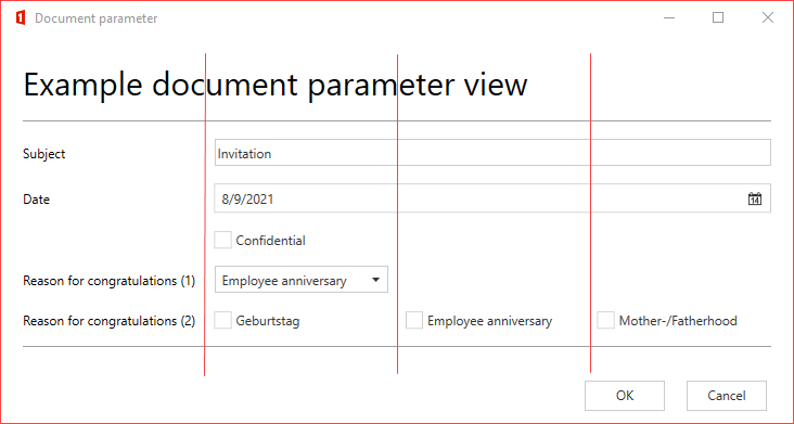
Example to illustrate the columns: (in German)
Configuration:
<View Id="main" Label="Homepage">
  <Row>
    <TextBlock Style="h1" ColumnSpan="4">Example document parameter view</TextBlock>
  </Row>
  <Row>
    <Separator />
  </Row>
  <Row>
    <Label Content="Subject" />
    <TextBox Id="DocParam.Subject" ColumnSpan="3" />
  </Row>
  <Row>
    <Label Content="Date" />
    <DatePicker Id="DocParam.DateOfWriting" ColumnSpan="3" />
  </Row>
  <Row>
    <CheckBox Id="DocParam.IsConfidential" Label="Confidential" ColumnOffset="1" ColumnSpan="3" />
  </Row>
  <Row>
    <Label Content="Reason for congratulations (1)" />
    <ComboBox Id="DocParam.ReasonForCongratulation1" />
  </Row>
  <Row>
    <Label Content="Reason for congratulations (2)" />
    <RadioButton Id="DocParam.ReasonForCongratulation2" Value="birthday" Label="Geburtstag" />
    <RadioButton Id="DocParam.ReasonForCongratulation2" Value="employee anniversary" Label="Employee anniversary" />
    <RadioButton Id="DocParam.ReasonForCongratulation2" Value="mother-/fatherhood" Label="Mother-/Fatherhood" />
  </Row>
  <Row>
    <Separator />
  </Row>
  <Button Type="Submit" Label="OK" IsDefault="true" />
  <Button Type="Cancel" Label="Cancel" />
</View>
Result (columns were marked):
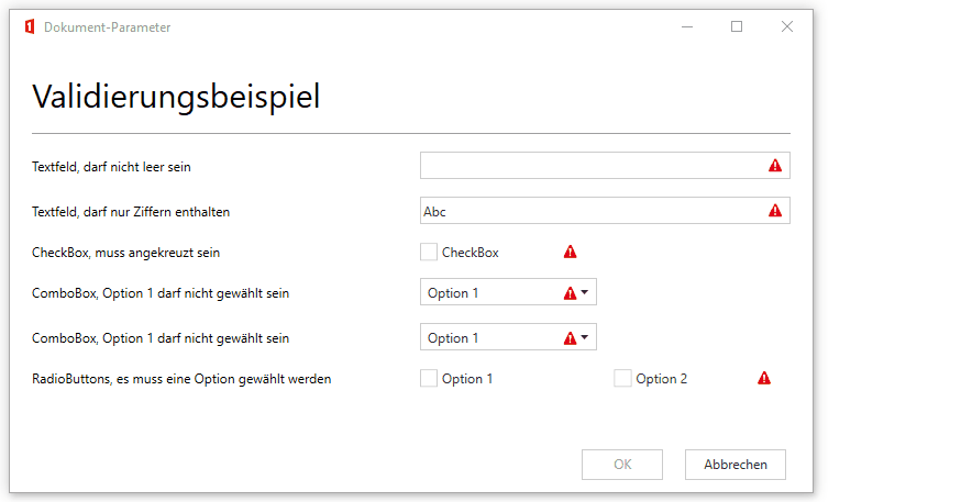
Validation
User input can be validated, as mentioned. If one or more fields are marked accordingly, the user cannot leave the Document Parameter dialog until the conditions are met.
Overview of all validation options:
- DataNode controls
- "Text": with
RequiredorRegex. - "CheckBox": with
Required
- "Text": with
- Form controls
- "ComboBox": with
IsInvalidWhenValue - "RadioButton": when linked to text element with
Required. TheShowRequiredIncicatorattribute is used to determine where the warning icon should be displayed.
- "ComboBox": with
Example (in German):
Bindings
Simple Bindings
Bindings refer to other values and can use them as "value basis" and for queries. Bindings can be used to control the following attributes:
| Possible attributes | Description |
|---|---|
| IsEnabled | Applies to all controls. Defines whether the field may be used (enter text in a textbox, click on a CheckBox, select something from a ComboBox etc.) |
| IsVisible | Applies to all controls. Defines whether a field is visible. |
| Value | Applies to all controls that have a value, not buttons. By "binding" it, a value of a field can be transferred to another field. |
| TargetView | Used for buttons to go to the next view. |
IsVisible example:
<Button Bind="IsVisible: $('DocParam.Advanced') != 'true'" TargetView="Final" Label=">" />
<Button Bind="IsVisible: $('DocParam.Advanced') == 'true'" TargetView="Notes" Label="Notes >" />
The button named "Notes >" is displayed in the Document Parameter only if there is a value "DocParam.Advanced" = "true" (i.e. an enabled CheckBox). IsEnabled works the same way.
TargetView example:
<Button Bind="TargetView: $('DocParam.Type')" />
Value Bind example:
Values can also be bound to controls, e.g. to display an overview of the entered data on the last page:
<Row>
<Label Content="Notes aktive:" />
<CheckBox IsEnabled="false" ColumnSpan="3" Bind="Value: $('DocParam.Advanced')" />
</Row>
<Row>
<Label Content="Notes:" />
<TextBlock IsEnabled="false" ColumnSpan="3" Bind="Value: $('DocParam.Notes')" />
</Row>
<Row>
<TextBlock>Number Input:</TextBlock>
<TextBox Id="NumberTest" />
<TextBlock>Number Output:</TextBlock>
<TextBlock Bind="IsVisible: $('NumberTest') >= 100">EQUAL OR OVER 100!</TextBlock>
<TextBlock Bind="IsVisible: $('NumberTest') < 100">BELOW 100!</TextBlock>
</Row>
<Row>
<TextBlock>Number with Combine:</TextBlock>
<TextBox Id="NumberTestA" />
<TextBox Id="NumberTestB" />
</Row>
<Row>
<TextBlock>Output:</TextBlock>
<TextBlock Bind="IsVisible: $('NumberTestA') > 100 && $('NumberTestB') > 100">Both are over 100!</TextBlock>
<TextBlock Bind="IsVisible: $('NumberTestA') > 100 || $('NumberTestB') > 100">One Is over 100!</TextBlock>
</Row>
Instead of individual controls, entire rows can also be bound:
Row example:
<Row Bind="IsVisible: $('DocParam.Advanced') == 'true'">
  <TextBlock>Only visible if the CheckBox with id "DocParam.Advanced" is activated.</TextBlock>
</Row>
Comparison operators of bindings:
| Operator | Description |
|---|---|
!= |
unequal, applies to text and numbers. |
== |
equal, applies to text and numbers |
> for > |
greater than (XML attributes do not allow < or >, so < or > must be used) |
>= for >= |
greater than or equal to |
< for < |
less than |
<= for <= |
less than or equal to |
Multiple conditions can be linked with AND or OR:
||for OR&&for AND (stands for &&) (XML attributes do not allow "&", so&must be used)
Multiple bindings can also be specified separated by ,:
<TextBlock ColumnSpan="4" Bind="Value: $('DocParam.Notes'), IsEnabled: 'false'" />
"Calc": Calculations in bindings
The value bases for the bindings can be extended with mathematical functions. The addressing of the fields remains the same ($('DocParam.Xyz')). To link the fields mathematically, the normal base operators (+, -, /, *) can be used.
Overview of all possible operators and how they are used:
| Operator | Description |
|---|---|
Base operators like +, -, *, / |
Base operators |
| Standard functions like square root, sin, tan, cos, etc. | Standard functions |
==, !=, <=, etc. |
Boolean operators |
| Other functions | rnd():The rnd() function is used to round numbers. The passed value is rounded to the nearest integer.Examples: Calc('rnd(10.23 * 10) / 10';'F2') → Rounds 102.3 to the nearest integer (102) and divides it again by 10 → 10.20Calc('rnd(1510 / 100) * 100';'F0')) → Rounds 15.10 to the nearest integer (15) and multiplies it by 100 → 1500. |
Each Calc call contains as final argument the formatting string, separated from the term by a ;. This value can be omitted (but the enclosing '' cannot). The ; is mandatory.
Formatting:
- N2 → Number with two decimal places (default).
- C2 → Currency format according to the currently selected document language with two decimal places.
Complete list with format codes: https://docs.microsoft.com/de-de/dotnet/standard/base-types/standard-numeric-format-strings
Syntax:
Calc('Term';'Format')
Calc('$('DocParam.Field1') + $('DocParam.Field2')';'')
Calc('$('DocParam.Field1') + ($('DocParam.Field2') * $('DocParam.Field2'))';'C2')
Caution
After the ; there must be either a value or nothing. Calc('Term'; ) leads to an error, correct is Calc('Term';'') / Calc('Term';'Format').
If a boolean comparison is performed in the Calc function (Calc('DocParam. Node1 == DocParamNode2';'F0')), then it is essential to note that the formatting is set to F0, because the return value must be 0 or 1 (for true/false) and if F0 is not specified as formatting, the value will be 1. 00, which is not recognized as a boolean "true".
For comparisons like Calc('Term';'Format') == 'Value' care must be taken that the corresponding Value is specified with the correct format (default xx.yy), otherwise the comparison will fail. 10.00 == 10 will be evaluated as "false".
The library used is capable of calculating exponent-before-dot-before-dash. → ( a + b * c) == (a + (b * c)) != ((a + b ) * c) . The calc keyword is not case sensitive.
Examples
Value-Bind:
<Row>
  <Label Content="Addition" />
  <TextBox Id="DocParam.OutputAdd" ColumnSpan="3" Bind="Value: Calc('$('DocParam.Field1') + $('DocParam.Field2')';'C2')" />
</Row>
IsVisible-Bind:
<Row>
  <Label Content="IsVisible" />
  <TextBox Id="DocParam.OutputSubtract" ColumnSpan="3" Bind="IsVisible: Calc('$('DocParam.Field1') - $('DocParam.Field2')';'C2') == 'CHF 20.00'" />
</Row>
<Row>
  <Label Content="IsVisible" />
  <TextBox Id="DocParam.OutputSubtract" ColumnSpan="3" Bind="IsVisible: Calc('$('DocParam.Field1') - $('DocParam.Field2')';'') == '20.00'" />
</Row>
Furthermore Calc offers the possibility to "count" selected CheckBoxes:
<Row Bind="IsVisible: Calc('$('Checkbox1') + $('Checkbox2') + $('Checkbox3') + $('Checkbox4')';'F0') == '2'">
  <Label Content="Label">
</Row>
The boolean "Checked" value of the checkbox is converted by Calc to an integer with value 0 for false (= not checked) and 1 for true (= checked), so that the values can be added together. The above example stands for: "If two of the checkboxes 1 through 4 are selected, then display the Row with the label." Attention must be paid to the formatting: Mandatory without decimal places, because 1.00 is not equal to 1, and accordingly cannot be converted back to a boolean value.
Unless default values are specified in the DataNode elements, all Calc binding values are initialized with 0. Especially for "IsEnabled"- and "IsVisible"-bindings with "Calc"-conditions you should pay attention to valid default values, otherwise the condition is always fulfilled initially.
Script – JavaScript
For requirements that cannot be covered with the usual configurations, the Document Parameter document function offers the possibility to write JavaScript.
The Script element is inserted at the following position:
<Configuration>
  <CustomContentSection [...]>
    <DataNodes>
      [...]
    </DataNodes>
  </CustomContentSection>
  <Views>
    <Script>
      <![CDATA[
        // JavaScript can be written here.
      ]]>
    </Script>
    <View>
      [...]
    </View>
  </Views>
</Configuration>
JavaScript functions can be defined within the Script element. Valid ECMAScript 5.1 is allowed.
JavaScript knowledge is required to use this feature. The basics of JavaScript are not listed in this documentation.
There are two ways to call the functions:
- Using the
OnSubmitattribute on theViewselement (see example above)
Eithertrueorfalsemust be returned for these functions:true: No validation error = Document Parameter dialog is exited.false: Validation error, validation overview is displayed = Document Parameter dialog remains open
- Via the
OnChangeattribute on a view value control (e. e.g. on aTextBoxcontrol; see example above)
No return value is required for these functions.
For interaction with DataNode controls, the OO object can be used as follows:
OO.getValue("ANY_ID"): Returns the text value of the DataNode control with the corresponding id. Example:var valueFromExampleDocParam = OO.getValue("DocParam.Example");OO.setValue("ANY_ID", "ANY_VALUE"): Sets the text value of the DataNode control with the corresponding id. Example:OO.setValue("DocParam.Example", "New content...");.OO.addValidationMessage("ANY_ID", "ANY_VALIDATION_MESSAGE"): Sets a validation error with a message for the DataNode control with the corresponding id. Note: All validation messages are displayed in the validation overview. If a control with the given id is found, an error message is displayed. Example:OO.addValidationMessage("DocParam.Example", "If X and Y have been set, something must be entered in the Example field.");
DataSources
The DataSources feature is documented on this page.
Examples about all topics on this page
Simple Document Parameter dialog:
Configuration of a simple Document Parameter dialog:
<Configuration>
  <CustomContentSection Name="Dokument-Parameter" WindowWidth="750" WindowHeight="750">
    <DataNodes>

      <Text Id="DocParam.Subject" />
      <DateTime Id="DocParam.CreationTime" Format="d. MMMM yyyy" />

      <CheckBox Id="DocParam.CheckBox1" />

      <ComboBox Id="DocParam.ComboBox1" SelectedValue="default">
        <Item DisplayText="Option 1" Value="opt1" />
        <Item DisplayText="Option 2" Value="opt2" />
        <Item DisplayText="Option 3" Value="opt3" />
      </ComboBox>

      <Text Id="DocParam.TextNodeForRadio" />
      <ComboBox Id="DocParam.ComboBoxForRadio">
        <Item DisplayText="Option 1" Value="opt1" />
        <Item DisplayText="Option 2" Value="opt2" />
        <Item DisplayText="Option 3" Value="opt3" />
      </ComboBox>

    </DataNodes>
  </CustomContentSection>
  <Views IsDebug="false">
    <View Id="main" Label="Homepage">
      <Row>
        <TextBlock Style="h1" ColumnSpan="4">Title</TextBlock>
      </Row>
      <Row>
        <Separator ColumnSpan="4" />
      </Row>
      <Row>
        <Label Content="Subject" />
        <TextBox Id="DocParam.Subject" ColumnSpan="3" />
      </Row>
      <Row>
        <Label Content="Date" />
        <DatePicker Id="DocParam.CreationTime" ColumnSpan="3" />
      </Row>
      <Row>
        <CheckBox Id="DocParam.CheckBox1" Label="CheckBox with ColumnOffset=1" ColumnOffset="1" ColumnSpan="2" />
      </Row>
      <Row>
        <Label Content="this is a Combobox" ColumnSpan="1" />
        <ComboBox Id="DocParam.ComboBox1" ColumnSpan="2" />
      </Row>
      <Row>
        <Label Content="RadioButton based on a TextNode" ColumnSpan="4"></Label>
      </Row>
      <Row>
        <Separator ColumnSpan="4" />
      </Row>
      <Row>
        <!-- Configuration of a RadioButton via a DataNode control of type Text. If the DataNode control of type Text is used in the document, then the Value of the selected option is inserted. The other options can no longer be selected in the document, only via the document parameter dialog. -->
        <RadioButton Id="DocParam.TextNodeForRadio" Value="opt1" Label="Option 1" />
        <RadioButton Id="DocParam.TextNodeForRadio" Value="opt2" Label="Option 2" />
        <RadioButton Id="DocParam.TextNodeForRadio" Value="opt3" Label="Option 3" />
      </Row>
      <Row>
        <!-- Inserts an empty row, can be used to better separate elements visually. -->
        <TextBlock />
      </Row>
      <Row>
        <Label Content="RadioButton based on a ComboBoxNode" ColumnSpan="4" />
      </Row>
      <Row>
        <Separator ColumnSpan="4" />
      </Row>
      <Row>
         <!-- Configuration of a RadioButton using a DataNode control of type ComboBox. When the DataNode control of type ComboBox is used in the document, the label of the selected option is displayed. The other options can still be selected via the ComboBox of Word. -->
        <RadioButton Id="DocParam.ComboBoxForRadio" Value="opt1" Label="Option 1" />
        <RadioButton Id="DocParam.ComboBoxForRadio" Value="opt2" Label="Option 2" />
        <RadioButton Id="DocParam.ComboBoxForRadio" Value="opt3" Label="Option 3" />
      </Row>
      <Button Type="Submit" Label="OK" IsDefault="true" />
      <Button Type="Cancel" Label="Cancel" />
    </View>
  </Views>
</Configuration>
The corresponding dialog:

Validation (in German):
<Configuration>
  <CustomContentSection Name="Dokument-Parameter" WindowWidth="750" WindowHeight="750">
    <DataNodes>

      <Text Id="DocParam.Subject" Required="true" ValidationMessage="Bitte geben sie einen Betreff ein" />
      <Text Id="DocParam.4NumbersMax" Regex="^[0-9]{1,4}$" ValidationMessage="Die Zahl darf maximal aus vier Ziffern bestehen und muss natürlich sein" />

    </DataNodes>
  </CustomContentSection>
  <Views>
    <View Id="main" Label="Startseite">
      <Row>
        <TextBlock Style="h1" ColumnSpan="4">Titel</TextBlock>
      </Row>
      <Row>
        <Separator ColumnSpan="4"/>
      </Row>
      <Row>
        <Label Content="Betreff" />
        <TextBox Id="DocParam.Subject" ColumnSpan="3" />
      </Row>
       <Row>
        <Label Content="Maximal Vierstellige, natürlich Zahl" />
        <TextBox Id="DocParam.4NumbersMax" ColumnSpan="3" />
      </Row>
      <Button Type="Submit" Label="OK" IsDefault="true" />
      <Button Type="Cancel" Label="Abbrechen" />
    </View>
  </Views>
</Configuration>
Behavior of the dialog:

Simple Bindings (in German):
<Configuration>
<CustomContentSection Name="Dokument-Parameter" WindowWidth="750" WindowHeight="750">
<DataNodes>
<CheckBox Id="DocParam.Checkbox1" />
<Text Id="DocParam.TextNode1" />
</DataNodes>
</CustomContentSection>
<Views>
<View Id="main" Label="Startseite">
<Row>
<TextBlock Style="h1" ColumnSpan="4">Titel</TextBlock>
</Row>
<Row>
<Separator ColumnSpan="4"/>
</Row>
<Row>
<Label Content="Name für CustomLabel"></Label>
<TextBox Id="DocParam.TextNode1"></TextBox>
</Row>
<Row>
<CheckBox Id="DocParam.Checkbox1" Label="Zeige CustomLabel"></CheckBox>
</Row>
<Row>
<Label Content="CustomLabel: " Bind="IsVisible: $('DocParam.Checkbox1')"></Label>
<!-- Single, double binding with one condition per bound attrbut (isVisible, Value) -->
<TextBlock Bind="IsVisible: $('DocParam.Checkbox1'), Value: $('DocParam.TextNode1')"></TextBlock>
</Row>
<!-- Simple Value Binding -->
<Row Bind="IsVisible: $('DocParam.TextNode1') == 'Hello'">
<TextBlock>CustomLabel hat den Wert 'hello'</TextBlock>
</Row>
<!-- IsVisible binding with an AND condition (&& → && ) -->
<Row Bind="IsVisible: $('DocParam.Checkbox1') && $('DocParam.TextNode1') == 'Hello'">
<TextBlock Value="">CustomLabel ist sichtbar UND hat den Wert 'Hello'</TextBlock>
</Row>
<!-- IsVisible binding with an OR condition -->
<Row Bind="IsVisible: $('DocParam.Checkbox1') || $('DocParam.TextNode1') == 'hello'">
<TextBlock>CustomLabel ist sichtbar ODER hat den Wert 'hello'</TextBlock>
</Row>
<Button Type="Submit" Label="OK" IsDefault="true" />
<Button Type="Cancel" Label="Abbrechen" />
</View>
</Views>
</Configuration>
Behavior of the dialog:

Bindings: Calc (in German)
<Configuration>
<CustomContentSection Name="Dokument-Parameter" WindowWidth="750" WindowHeight="750">
<DataNodes>
<!-- Input fields for the mathematical functions with valid default values -->
<Text Id="DocParam.Field1">1</Text>
<Text Id="DocParam.Field2">1</Text>
<Text Id="DocParam.TestNode2" />
<Text Id="DocParam.OutputAdd" />
<Text Id="DocParam.OutputSubtract" />
<Text Id="DocParam.OutputDivide" />
<Text Id="DocParam.OutputMultiply" />
<Text Id="DocParam.CB1" />
<Text Id="DocParam.CB2" />
<Text Id="DocParam.CB3" />
<Text Id="DocParam.CB4" />
</DataNodes>
</CustomContentSection>
<Views>
<View Id="main" Label="Startseite">
<Row>
<TextBlock Style="h1" ColumnSpan="4">Titel</TextBlock>
</Row>
<Row>
<Separator ColumnSpan="4"/>
</Row>
<Row>
<Label Content="Wert 1" />
<TextBox Id="DocParam.Field1" ColumnSpan="3"/>
</Row>
<Row>
<Label Content="Wert 2" />
<TextBox Id="DocParam.Field2" ColumnSpan="3" />
</Row>
<Row Bind="IsVisible: Calc('$('DocParam.Field1') + $('DocParam.Field2') > 1000';'F0') ">
<TextBlock>Wert1 + Wert2 Ergeben mehr als 1000</TextBlock>
</Row>
<Row>
<Label Content="Ergebnis Addition" />
<!-- Simple CalcBinding with addition and formatting to two decimal places in currency format -->
<TextBox Id="DocParam.OutputAdd" ColumnSpan="3" Bind="Value: Calc('$('DocParam.Field1') + $('DocParam.Field2')';'C2')" />
</Row>
<Row>
<Label Content="Ergebnis Subtraktion" />
<!-- Simple CalcBinding with subtraction and formatting to two decimal places in currency format -->
<TextBox Id="DocParam.OutputSubtract" ColumnSpan="3" Bind="Value: Calc('$('DocParam.Field1') - $('DocParam.Field2')';'C2')" />
</Row>
<Row>
<Label Content="Ergebnis Division" />
<!-- Simple CalcBinding with division and formatting to three decimal places in decimal format -->
<TextBox Id="DocParam.OutputDivide" ColumnSpan="3" Bind="Value: Calc('$('DocParam.Field1') / $('DocParam.Field2')';'F3')" />
</Row>
<Row>
<Label Content="Ergebnis Multiplikation" />
<!-- Simple CalcBinding with multiplication and formatting to two decimal places in currency format -->
<TextBox Id="DocParam.Outputmultiply" ColumnSpan="3" Bind="Value: Calc('$('DocParam.Field1') * $('DocParam.Field2')';'C2')" />
</Row>
<Row>
<CheckBox Id="DocParam.CB1" Label="CB1"></CheckBox>
<CheckBox Id="DocParam.CB2" Label="CB2"></CheckBox>
<CheckBox Id="DocParam.CB3" Label="CB3"></CheckBox>
<CheckBox Id="DocParam.CB4" Label="CB4"></CheckBox>
</Row>
<!-- Calc Binding to "count" selected checkboxes -->
<Row Bind="IsVisible: Calc('$('DocParam.CB1') + $('DocParam.CB2') + $('DocParam.CB3') + $('DocParam.CB4')';'F0') == '1'">
<Label Content="Eine Checkbox angewählt"></Label>
</Row>
<Row Bind="IsVisible: Calc('$('DocParam.CB1') + $('DocParam.CB2') + $('DocParam.CB3') + $('DocParam.CB4')';'F0') == '2'">
<Label Content="Zwei Checkboxen angewählt"></Label>
</Row>
<Row Bind="IsVisible: Calc('$('DocParam.CB1') + $('DocParam.CB2') + $('DocParam.CB3') + $('DocParam.CB4')';'F0') == 3">
<Label Content="Drei Checkboxen angewählt"></Label>
</Row>
<Row Bind="IsVisible: Calc('$('DocParam.CB1') + $('DocParam.CB2') + $('DocParam.CB3') + $('DocParam.CB4')';'F0') == 4">
<Label Content="Vier Checkboxen angewählt"></Label>
</Row>
<Button Type="Submit" Label="OK" IsDefault="true" />
<Button Type="Cancel" Label="Abbrechen" />
</View>
</Views>
</Configuration>
Behavior of the dialog:
