Document Parameter – Legacy configuration
In addition to the current configuration options from the Document Parameter, there are options for configuration that are no longer recommended in this way, but for which backward compatibility still works. The corresponding deprecated configuration possibilities are listed on this page.
Changes at a glance
CustomDataNodes (Fields):
<Configuration>
  <CustomContentSection [...]>
    <DataNodes>

      <!-- ## Text ## -->
      <CustomDataNode xsi:type="TextNode" Id="DocParam.ExampleText" [...]>[...]</CustomDataNode>
      <!-- NEW ↓ -->
      <Text Id="DocParam.ExampleText" [...]>[...]</Text>

      <!-- ## CheckBox ## -->
      <CustomDataNode xsi:type="CheckBoxNode" Id="DocParam.ExampleCheckBox" IsChecked="true" [...] />
      <!-- NEW ↓ -->
      <CheckBox Id="DocParam.ExampleCheckBox" [...]>true</CheckBox>

      <!-- ## DateTime ## -->
      <CustomDataNode xsi:type="DateTimeNode" Id="DocParam.ExampleDateTime" DateFormat="dddd, d. MM. yyyy" IsNowDefault="true" [...]>
        <DateTime>2016-07-31</DateTime>
      </CustomDataNode>
      <!-- NEW ↓ -->
      <DateTime Id="DocParam.ExampleDateTime" Format="dddd, d. MM. yyyy" [...]>2018-12-31</DateTime>

      <!-- ## ComboBox ## -->
      <CustomDataNode xsi:type="ComboBoxNode" Id="DocParam.ExampleComboBox" SelectedValue="aKey" [...]>
        <ListItems>
          <Item><Key><string>empty</string></Key> <Value><string><![CDATA[ ]]></string></Value></Item>
          <Item><Key><string>aKey</string></Key> <Value><string>A-Displaytext</string></Value></Item>
          <Item><Key><string>aKey</string></Key> <Value><string>A-Displaytext</string></Value></Item>
          <Item><Key><string>bKey</string></Key> <Value><string>B-Displaytext</string></Value></Item>
        </ListItems>
      </CustomDataNode>
      <!-- NEW ↓ -->
      <ComboBox Id="DocParam.BeispielComboBox" SelectedValue="empty" [...]>
        <Item Value="empty" DisplayText=" "  />
        <Item Value="aKey" DisplayText="A-Displaytext" />
        <Item Value="bKey" DisplayText="B-Displaytext" />
      </ComboBox>

    </DataNodes>
  </CustomContentSection>
  [...]
</Configuration>
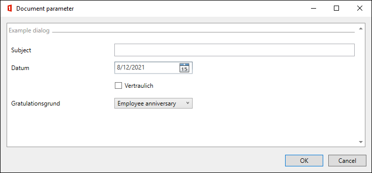
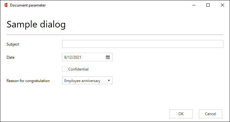
With and without views:
Without views (legacy):
With views (default):
Usage of "CustomDataNode" with "xsi:type".
Basic structure of a CustomDataNode:
<CustomDataNode xsi:type="" Id="" LCID=""></CustomDataNode>
These three attributes must be present in any case, regardless of the type, otherwise the CustomDataNode will not work properly.
CustomDataNode basic attributes
These attributes apply to use with and without views.
Important
The configurations on this page are obsolete and should no longer be used. However, they are still supported.
There is a more compact and structured configuration type. See this page.
| Name | Description |
|---|---|
| Type (xsi:type) | TextNode Inserted in Word as plain text content control, for single or multiline text input, check via regex possible DateTimeNode Inserts in Word as date picker content control with calendar selection and is also shown in the document parameter as such. CheckBoxNode Inserted in Word as a check box content control (CheckBox Content Control) and is for a yes/no selection. ComboBoxNode Inserted in Word as a combo box content control (Combo Box Content Control), also called a dropdown. It is for choosing between given values (any input is allowed in Word). RadioButton There are no RadioButton content controls in Word, that's why there is no RadioButton DataNode in OneOffixx. Instead, the TextNode or the ComboBoxNode are used as DataNode: Definition of a RadioButton with a TextNode Here, the RadioButton is stored in the TextNode. This option is suitable if the value is used in scripts or extended bindings. If a RadioButton is to be preselected, the Value of the corresponding RadioButton must be configured as the default text. So in the example below, the RadioButton is now preselected with "man". <CustomDataNode xsi:type="TextNode" Id="DocParam.RBGender">1</Text>" LCID="2055">1</CustomDataNode>{:.language-xml}Definition of a RadioButton with a ComboBoxNode In this case, the RadioButton is stored in the ComboBoxNode element. The Value in the ComboBox must correspond to the Value in the RadioButton in the view. This option is suitable if the value is to be output in the document, since the display in the document is controlled by the Value of the ComboBoxNode entry. If a RadioButton should be preselected, the Value of the corresponding RadioButton must be configured in the SelectedValue attribute of the ComboBoxNode. <CustomDataNode xsi:type="ComboBoxNode" Id="DocParam.RBGender" LCID="2055" SelectedValue="1">...</CustomDataNode>How the RadioButtons are then defined in the view is described in the corresponding chapter. No RadioButtons can be defined without views LabelNode Heading in document parameter dialog when views are not used, not suitable for use in editor, scripts and extended bindings |
| Id (Identification) | Textual Id, which must be unique. This is displayed in editor mode and then needed for use in editor, scripts or extended bindings. The Id must not contain any spaces. If an Id is duplicated (NOT in the view, but in the CustomDataNodes), then the documents parameter dialog can not be opened. |
| DateFormat | Attribute that is only allowed for DateTimeNodes; definition of the date format e. g. "dd MM yyyy" for "02.06.2016". List of date formats There are several date formats stored in the Global Translations base configuration that can be accessed. |
| IsNowDefault | attribute that is only allowed for DateTimeNodes. It sets the initial date to the current date. |
| Calendar | Attribute which is only valid for DateTimeNodes. It sets the format of the calendar. Default is "Gregor". It is not mandatory to set this attribute. |
| Required (required field) | Attribute that is only allowed for TextNodes. It defines whether the field may be left empty (Required="false" or not set) or whether the field must be filled in (Required="true"). As long as the text field is not filled in, the OK button for confirming the input in the document parameter remains grayed out and unclickable. As soon as the required characters are filled in the text field, the OK button can be clicked. The Required attribute is overridden by the validation (regex attribute) if one is set. |
| Regex (validation) | attribute, which is only allowed for TextNodes. It allows to define a regex (.NET syntax) that must find at least one match in the entered text. Attention: if the whole text must match or there must be exactly one 'match', this must be defined by the regex expression. Examples Regex="[0-9]+" forces that at least one character of the input text must be a digit. For example, "Hello 205" is a valid input. Regex="^[0-9]+$" forces that all characters of the input text must be digits and that at least one digit must be present. (^ matches the beginning of the input text and $ matches the end) Online tool to create regex |
| ValidationMessage (error message) | attribute, which is only allowed for TextNodes. If Required="true" or a validation regex is set, ValidationMessage allows a custom error message if validation fails. It will be displayed when the mouse pointer hovers over the red exclamation mark on the right side of the text field. If ValidationMessage is not set, a default message will be displayed in case of a mismatch. |
| Tracked (monitoring with "Quick Check") | The OneOffixx function Quick Check (check content controls) is activated with the 'Tracked' attribute. If the value is set to 'true', the field will be displayed to the user in the separate panel. Provided that the content of the element is empty, the field will be displayed red in the panel and green after editing. |
| Label (Label) | Label the element in the Quick Check panel in Word. The Tracked attribute is a prerequisite. |
| SelectedValue (Selected entry) | Attribute that is only allowed for ComboBoxNodes. This attribute determines which option in the list should be selected by default. |
| IsChecked (Default selection) | Attribute which is only valid for CheckBoxNodes. This attribute determines whether the CheckBox should be checked or unchecked by default. |
| Locked | Has no effect. Was originally intended to prevent the content control from being deleted in Word. |
| ReadOnly | Has no effect. Was originally intended to prevent the content control from being edited in Word. |
| LCID | The LCID (locale identifiers) define the language culture of the corresponding DataNode. If the LCID is not set, the DataNode will not work. List of LCID codes |
Configurations without "Views"
Basic configuration without using Views:
<Configuration>
  <CustomContentSection xmlns:xsd="http://www.w3.org/2001/XMLSchema" xmlns:xsi="http://www.w3.org/2001/XMLSchema-instance" Name="Dokument-Parameter" WindowWidth="750" WindowHeight="750">
    <DataNodes>
      <!-- DataNode elements are defined here -->
    </DataNodes>
  </CustomContentSection>
</Configuration>
CustomDataNode additional attributes without views
These attributes are only valid for use without views.
Important
The configurations on this page are obsolete and should no longer be used. However, they are still supported.
There is a more compact and structured configuration type. See this page.
| Name | Description |
|---|---|
| Row | Row in which the element is to be displayed in the document parameter dialog. |
| Column | Column in which the element is to be displayed in the document parameter dialog (starting point). There are 4 columns with the Label column. |
| ColumnSpan (Length) | Length respectively number of columns the element should span. |
| Label (Label) | Label of the element in the document parameter dialog; also applies to headings of the type LabelNode. If several elements are displayed in one line, the label of the first element is used. The label always appears in the leftmost column. If Tracked is set to true, the label also acts as the element's caption in the Quick Check panel. |
| Visible | If Visible is set to false, the document parameter will not be displayed in the dialog. |
| ToolTip (Hint) | Hint that is displayed when the user hovers over it with the mouse. Overridden by ValidationMessage if it is set. |
| IsInputEnabled (Caption editable) | Attribute only allowed for elements of type CheckBoxNode. If this option is set to true, checkboxes are displayed in the document parameter dialog where the user can edit or freely select the caption. |
| MultiLine attribute only allowed for elements of type TextNode. Creates multiline text fields if set to true. | |
| MultilineRows (Number of displayed rows for multiline) | Attribute only allowed for elements of type TextNode (incl. Multiline="true"). Defines the number of displayed rows in multiline text fields (defaults to 3). |
| IsSearchEnabled (Enable search for combo boxes) | Attribute only allowed for elements of type ComboBoxNode. This option determines whether keyboard input can be used to search for existing entries in the combo box. |
| IsEditable (Allow any input for combo box) | Attribute only allowed for elements of type ComboBoxNode. This option determines whether the user can make any input. If this attribute is not set to true the user can only choose between the existing entries. |

